Hey there, fellow home decor enthusiast! Ever walk into your house and feel like your entryway is… well, just there? Like it’s doing its job of getting you inside, but it’s not exactly rolling out the red carpet? I totally get it. Your entryway is the first impression your home makes, not just on guests, but on you every single day. And let’s be real, a lot of us are dealing with small entryway makeover challenges, or trying to figure out how to brighten dark entryway spaces.
For years, I treated my own entryway as an afterthought. It was just a place to dump keys and shoes, a dark little cave that served a purpose but offered zero joy. Then, one Saturday morning, armed with coffee and a sudden burst of inspiration (and maybe a little too much Pinterest scrolling for “entryway paint color ideas”), I decided enough was enough. The right paint color can seriously transform a cramped, dim, or just plain bland entry into a fresh, inviting, and utterly welcoming space. It’s like magic, but with less glitter and more rollers.
It’s amazing how a simple coat of paint can instantly make a space feel larger, more open, and way more cheerful. We’re talking about creating that “ahhh, I’m home” feeling the moment you step through the door. So, grab a comfy seat, because we’re about to dive into the best entryway paint colors that will instantly brighten your space and make coming home the best part of your day.
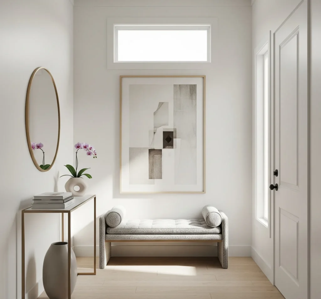
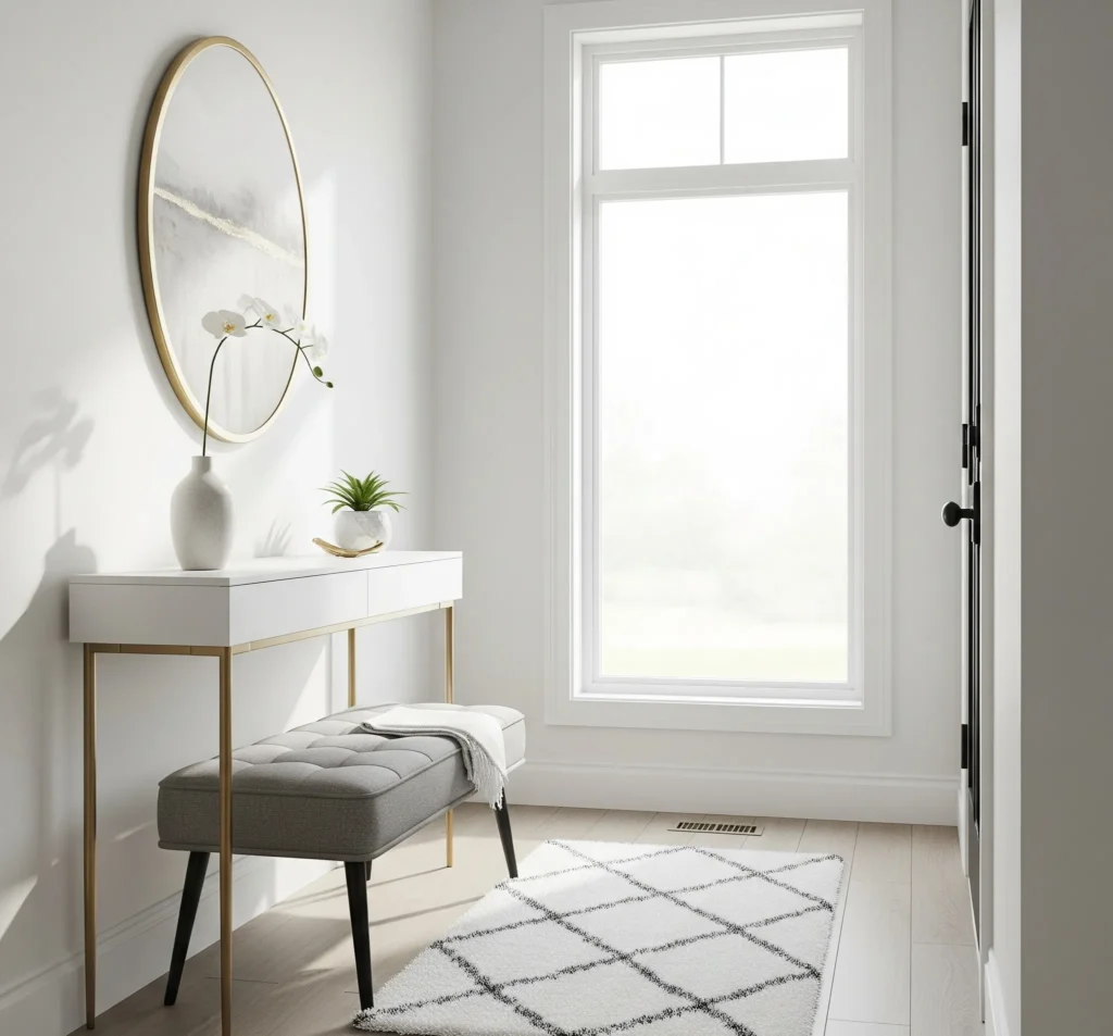
1. Classic White Entryway for a Clean, Airy Look
When you think “bright,” white is probably the first color that springs to mind, right? And for good reason! It’s the ultimate chameleon, reflecting light like a champ and making any space feel instantly larger and more open. But here’s the kicker: not all whites are created equal. Some can feel sterile, like a doctor’s office, and who wants that vibe when they walk in the door?
White paint colors for entryway walls
My absolute go-to white paint colors for entryway walls that don’t feel cold are Sherwin-Williams Alabaster and Benjamin Moore Simply White. Alabaster has this beautiful, creamy undertone that makes it feel incredibly soft and inviting. It’s warm without being yellow, which is a fine line to walk, IMO. Simply White, on the other hand, is a bit crisper but still has enough warmth to keep it from feeling stark. It’s a fantastic choice if you want something bright but still cozy.
So, when do you lean into warm whites versus cool whites? If your entryway gets a lot of natural light, especially from south-facing windows, a slightly cooler white can balance out the warmth and prevent the space from feeling too yellow. But if your entry is north-facing or generally dim, a warm white is your best friend. It’ll bounce what little light you have around and make the space feel much more cheerful. These are truly the best white paint for entryway spaces, transforming them into bright entryway color havens.
White entryways pair beautifully with black accents for a sophisticated, modern look, or with rich wood tones for a more traditional or rustic feel. Think black console tables, dark picture frames, or a warm oak bench.
Pro Tip: Before committing, paint a large swatch of your chosen white on all walls of your entryway. Observe it throughout the day in different lighting conditions. You’d be surprised how much a color can change from morning to evening!
2. Soft Neutrals That Warm Up the Space Without Darkening It
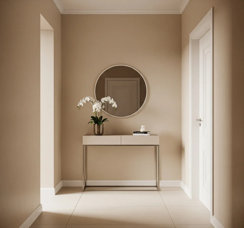
Okay, so maybe pure white feels a little too… well, pure for you. No worries! Soft neutrals are here to save the day, offering warmth and sophistication without sacrificing that much-needed brightness. These are your cozy neutral paint colors that feel like a warm hug.
Warm neutral entryway paint ideas
We’re talking about shades like greige, taupe, and creamy beige. Greige, a magical blend of gray and beige, is particularly fantastic because it adapts to your lighting. In some lights, it leans more gray; in others, more beige. It’s like getting two colors for the price of one, which, let’s be honest, is always a win. Benjamin Moore Revere Pewter is a classic greige paint for entryway spaces that I’ve seen work wonders in countless homes. For a richer, creamier beige, look at something like Sherwin-Williams Accessible Beige.
These warm entryway colors are brilliant because they feel incredibly homey and welcoming without sucking up all your precious natural light. They have just enough pigment to add depth and character, but they’re light enough to keep the space feeling open and airy. They’re especially great for homes with traditional or farmhouse styles, where you want to evoke a sense of comfort and timelessness. Imagine a creamy beige entryway with a distressed wood console table and a woven basket for umbrellas – perfection!
Pro Tip: When choosing a warm neutral, consider your home’s existing flooring and trim. A neutral with a subtle green or red undertone can clash with certain wood tones, so always test it out first.
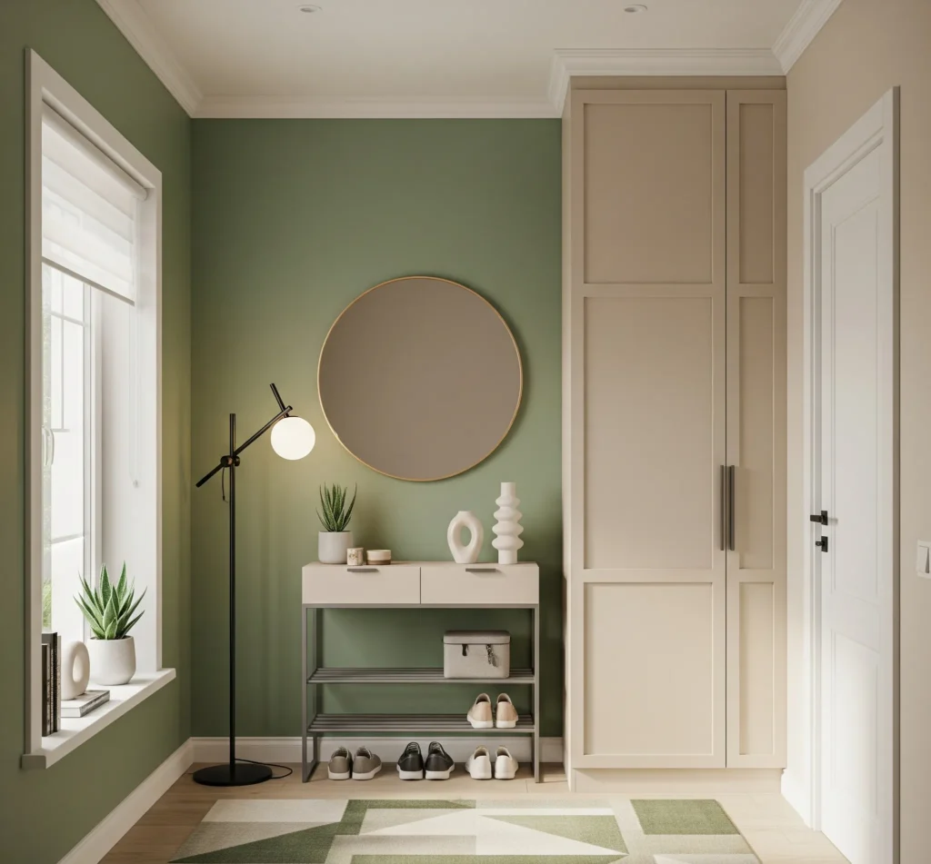
3. Pale Blues and Soft Greens for a Fresh Welcome
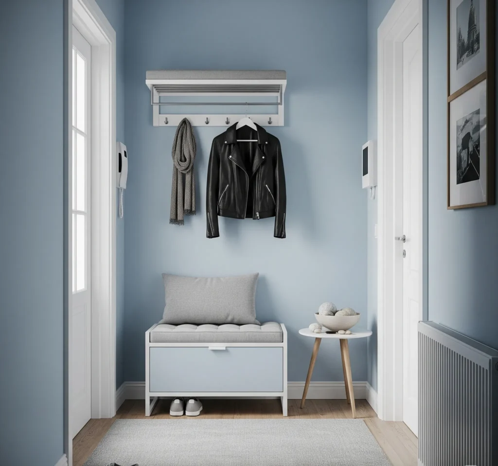
Want to bring a little bit of the outdoors in? Pale blues and soft greens are your ticket to a fresh, serene entryway. These aren’t just pretty colors; they’re known for their calming effects, making them perfect for that first impression.
Soothing entryway paint colors
I’m a huge fan of Benjamin Moore Palladian Blue and Sea Salt by Sherwin-Williams. Palladian Blue is this gorgeous, ethereal blue-green that shifts beautifully with the light. It’s incredibly soothing and feels like a breath of fresh air. Sea Salt, on the other hand, is a soft, muted green with a hint of gray, reminiscent of a misty morning by the ocean. Both of these colors mimic nature, creating a calm and tranquil vibe that instantly puts you at ease.
These hues pair beautifully with light wood furniture, like a whitewashed console or a natural oak bench. Throw in some natural fiber rugs – jute or sisal – and maybe a few potted plants, and you’ve got yourself a little oasis right inside your front door. If you’re looking for blue green entryway inspiration or soft green paint entry ideas, these are prime contenders. They also work wonders for pale blue hallway ideas, extending that calming feeling throughout your home.
Pro Tip: If your entryway lacks natural light, opt for a pale blue or green with a higher LRV (Light Reflectance Value) to ensure it still feels bright and airy, rather than looking dull.
4. Subtle Blush and Muted Terracotta for a Hint of Color
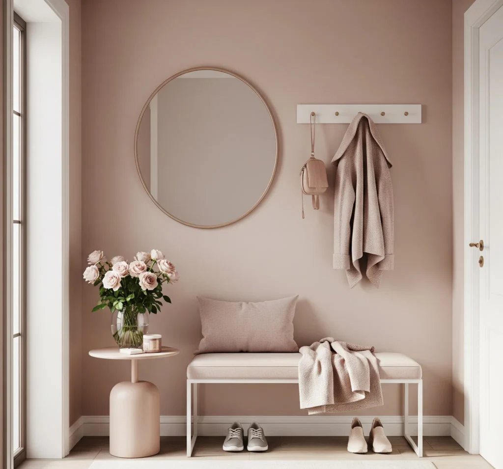
Feeling a little adventurous but still want to keep things bright and inviting? Subtle blush and muted terracotta shades are calling your name. These aren’t your grandma’s pepto-bismol pink or harsh orange; we’re talking sophisticated, earthy tones that add personality without overwhelming the space.
Blush and terracotta entryway wall color
Think of a muted, dusty rose or a soft, sun-baked terracotta entryway paint. These colors add warmth and a unique personality while still doing a fantastic job of reflecting light. They’re perfect for those who want a hint of color that feels grounded and chic. I’ve seen some stunning blush wall color ideas that just make a space feel so inviting and unique.
These earthy paint colors for small space entryways are particularly great for boho, modern, or earthy home styles. They just fit with that relaxed, curated vibe. To really make them sing, pair them with gold mirrors, woven accents like macrame wall hangings or rattan baskets, or even some brass lighting fixtures. The metallic and natural textures really pop against these warm, subtle hues. It’s a bold choice, but trust me, it’s a good one!
Pro Tip: To keep blush or terracotta from feeling too “sweet” or “muddy,” ensure the shade has a good amount of gray or brown undertone to mute it down.
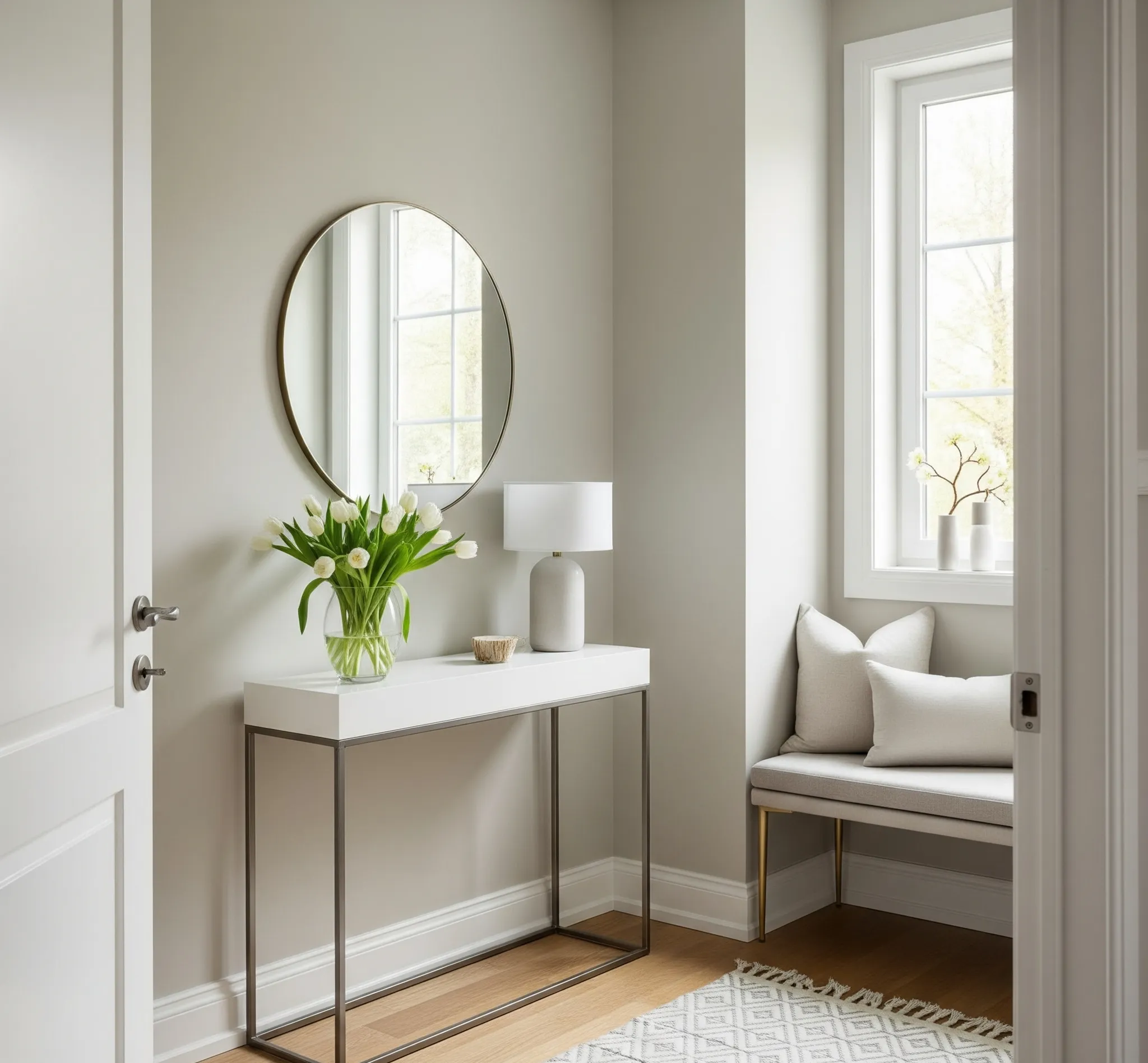
5. Light Gray and Greige for a Polished Look
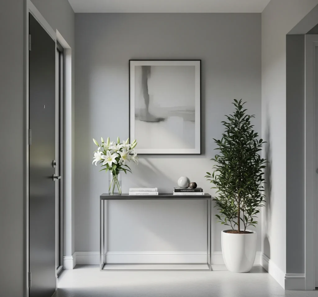
For those who crave a sleek, sophisticated, and utterly timeless look, light gray and greige are your best friends. These colors offer a polished backdrop that lets your decor shine. They’re the little black dress of entryway paint colors – always appropriate, always chic.
Modern gray paint for entryway
Light gray hallway paint is incredibly versatile, but here’s the secret sauce: picking the right undertone for your specific lighting. Grays can have blue, green, or even purple undertones, and those can really pop (or flop!) depending on the light. If your entryway gets cool, northern light, a gray with a warm undertone (like a greige paint color entryway) will prevent it from feeling too cold. If you have warm, southern light, a cooler gray can help balance things out. My personal favorite greige is still Benjamin Moore Revere Pewter, as mentioned earlier, but for a true light gray, check out Sherwin-Williams Repose Gray.
These shades look absolutely stunning with crisp white trim, creating a clean, defined edge. Pair them with minimalist decor – think clean-lined console tables, simple mirrors, and perhaps a single, striking piece of art. The beauty of a modern entry paint in light gray or greige is that it provides a calm, sophisticated canvas, allowing you to play with textures and subtle pops of color in your accessories.
Pro Tip: If you’re unsure about undertones, grab a few large paint swatches (not just the tiny chips!) and tape them to your wall. Observe them at different times of day to see how the light affects the color. This step is non-negotiable, trust me.
6. Two-Tone Walls or Painted Wainscoting for Depth Without Darkness
Want to add some architectural interest and depth to your entryway without making it feel like a dungeon? Two-tone walls or painted wainscoting are genius solutions, especially for those tricky, narrow, or oddly shaped spaces. It’s like giving your walls a stylish outfit.
Entryway two-tone wall ideas
The classic combo is a soft white on top and a muted, soft color below. Imagine a crisp white on the upper half, paired with a soothing pale green or a gentle pale blue on the bottom. This creates visual interest and makes the ceiling feel higher, which is always a bonus in a small entryway. It’s a fantastic way to introduce color without overwhelming the space, and it really highlights any architectural features like wainscoting or paneling.
Painted wainscoting ideas are particularly charming. You can paint the wainscoting a different color than the wall above it, or even paint the entire wainscoting in a deeper shade of the wall color for a subtle, monochromatic effect. This technique works wonders in narrow hallways, as the horizontal line of the wainscoting can visually widen the space. It’s also incredibly forgiving for high-traffic areas, as the lower portion of the wall tends to take the most abuse. This entryway color block paint method is both stylish and practical.
Pro Tip: When doing two-tone walls, use painter’s tape to create a super crisp line. For a classic look, aim for the dividing line to be about one-third or two-thirds up the wall from the floor.
7. Bonus: Paint Finish Matters – Choose Wisely!
Okay, so you’ve picked your perfect color. High five! But hold your horses, because there’s one more crucial decision that can make or break your entryway’s brightness and durability: the paint finish. This is where the rubber meets the road, literally, in a high-traffic area like an entryway.
Best paint finishes for entryways
For entryways, you’re generally going to be looking at satin, eggshell, or semi-gloss. My personal preference for walls in high-traffic areas is usually satin or eggshell. Why? Because they offer a nice balance of durability and a subtle sheen that helps reflect light without being overly glossy. Eggshell has a very low sheen, almost flat but with a slight eggshell-like texture (hence the name, duh!). Satin has a bit more luster, making it easier to clean – a huge plus when you’ve got kids, pets, or just, you know, life happening.
Semi-gloss, on the other hand, has a higher sheen and is super durable and washable. It’s often used for trim, doors, and cabinets, but you can use it on walls if you want maximum light reflection and washability. Just be aware that its higher sheen will highlight any imperfections on your walls, so make sure your prep work is top-notch. For high traffic hallway paint ideas, durability is key, and satin vs eggshell entry paint really comes down to how much sheen you prefer.
The finish absolutely affects how bright your space feels. A higher sheen will reflect more light, making the color appear brighter. But it also means more glare if you have direct sunlight. It’s a delicate dance, my friend.
Pro Tip: Always, always, always test swatches of your chosen color and finish in your entryway. Paint a good 2×2 foot section on a few different walls and observe how the light hits it throughout the day. This is the only way to truly see how the color and finish will behave in your unique space. Don’t skip this step unless you enjoy repainting!
Conclusion: Your Entry, But Brighter
So there you have it, a whole palette of ideas to transform your entryway from “meh” to “marvelous.” Remember, your entryway is the first hello your home gives, so let’s make it a warm, bright, and inviting one! Whether you lean towards a crisp white, a cozy neutral, a serene blue-green, a subtle blush, or a sophisticated gray, the right paint color truly has the power to instantly brighten your space and set the tone for your entire home.
Don’t be afraid to experiment! Grab some paint swatches, tape them up, and live with them for a few days. See how the natural light plays with the colors, and most importantly, choose a color that genuinely makes you happy every time you walk through the door. After all, it’s your home, your rules. Now go forth and paint something beautiful! I can’t wait to see your bright entryway color ideas. Happy pinning!
📌 Most Popular Entryway Paint Colors on Pinterest Right Now
If you’re still looking for a little extra nudge, here are some trending entryway colors that Pinterest users are absolutely loving right now. These are serious pinterest favorite paint colors for a reason!
- Sherwin-Williams Alabaster: The ultimate warm white, perfect for a soft, inviting glow.
- Benjamin Moore Revere Pewter: The king of greiges, offering a perfect balance of warm and cool.
- Sherwin-Williams Sea Salt: A calming, muted green-blue that brings the outdoors in.
- Benjamin Moore Pale Oak: A beautiful, light greige that feels incredibly sophisticated and airy.
- Farrow & Ball Elephant’s Breath: A warm, contemporary gray with a hint of magenta, surprisingly versatile and chic.